CSS
While HTML is the specific elements on a webpage, CSS determines how those elements visually appear. This is how you make a website look gorgeous. This files have the extension .css
Good documentation on CSS can be found here: CSS MDN Docs
Properties
Properties are things like background-color or border and define properties of a specific element.
img {
  background-color: blue;
}
Classes
In HTML you can define classes like:
<p class="main-paragraph">This is a paragraph with "main-paragraph" class</p>
Then in CSS you can change what the class does like:
.paragraph-class {
  background-color: blue;
}
Pseudo Classes
These look like :hover and would be used like img:hover and define properties under specific circumstances outlined by the pseudo-class. Hover determines what happens when a users mouse hovers over an item.
A few other useful pseudo classes include :hover :link :viewed :empty :in-range
Favicon
The little image next to a website title is called a favicon. It can be up to 64x64. What is a favicon
You can use (https://favicon.io/) to generate a favicon from an image.
Box Design
With CSS, elements have a box around them which includes the content, then padding, border, and margin. You can view these by opening up the developer tools with Ctrl + Shift + I.
Display Elements
Block Elements
Block elements take up an entire row.
Ex. p, h1-h6, div, ol, ul, li, form
Inline Elements
Inline elements take up only as much space as they need to.
Ex. span, img, a (anchor)
Inline Block
Inline Block elements give the best of both worlds. You can set this like:
div {
  display: inline-block;
}
Visibility of Elements
visibility: hidden; leaves the element posititoning there, but hides the element otherwise.
display: none; basically deletes the element.
Position
Static
How it displays just from HTML "normally"
Relative
Position element selected relative to how it would be positioned static. Doesn't push any other elements.
This effectively leaves a "ghost" element from where it was originally placed.
Set with position: relative;
Coordinates determine how to move an element. Top, bottom, left, or right.
Ex.
left: 60px; moves the element 60px FROM the left edge of where it was previously at.
Absolute
Positions element relative to its PARENT. Set with position: absolute;. Must set parent to position: relative;
Ex. right: 60px moves the element 60px from the right edge of its PARENT.
Fixed
Position of element is relative to webpage. So if you scroll it remains in the same spot on your screen. This is useful for a nav bar or side bar that you always want visible.
Centering
Inside parent, can set text-align: center;. This works for inline, and block elements, but not inline-block elements or modified width block elements. Inside element, can do margin: auto; to get around this issue.
Looks like margin: 'top' 'right' 'bottom' 'left' so if you want to center horizontally but not vertically, use margin: 0 auto 0 auto;. Shorthand version of this is margin: 0 auto;
Fonts
Common free method is to use Google Fonts.
Font Design Rules
Some good font design rules to follow:
- Use similar moods
- Use similar time era, don't mix traditional with modern
- Contrast serif-ness. Like using a serif font for heading and a sans-serif font for body
- Can create interest by just varying the weights, like making headers much bolder
Font Size
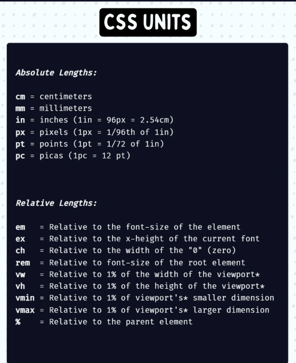
Sizing in CSS can be difficult. For example, px is not dynamic, but percentages of em are. 100% = 1em = 16px
Percentages and em inherets from parent. Using rem instead of em allows you to ignore all parent settings. It's generally better.
CSS Units
Float
To make text float around an image, in the image set float: left; or another side.
Only use float when necessary. There are many edge cases.
Clear
To prevent an element from following the float, use clear: left; or another side to cause it to not float for objects on that side.
Buttons
Box Sizing
Setting box-sizing: border-box; tells browser to take into account any border and padding into element's width and height. This is generally preferred.
Ex. If you set element's width to 100 pixels, that 100 pixels will include any border or padding you added, and the content box will shrink to absorb that extra width.
Media Queries
At the heart of responsive design is media queries. These allow you to change how a webpage displays depending on screen dimensions.
Example media queries:
.example-media-queries {
  @media (min-width: 320px) {
    /* smartphones, iPhone, portrait 480x320 phones */
  }
  @media (min-width: 481px) {
    /* portrait e-readers (Nook/Kindle), smaller tablets @ 600 or @ 640 wide. */
  }
  @media (min-width: 641px) {
    /* portrait tablets, portrait iPad, landscape e-readers, landscape 800x480 or 854x480 phones */
  }
  @media (min-width: 961px) {
    /* tablet, landscape iPad, lo-res laptops ands desktops */
  }
  @media (min-width: 1025px) {
    /* big landscape tablets, laptops, and desktops */
  }
  @media (min-width: 1281px) {
    /* hi-res laptops and desktops */
  }
}